One of the common methods that businesses and organizations use to make sense of their complex and scattered data is data visualization. Data visualizations provide a quick way to understand the masses of data collected - - providing easy access to insights needed to drive growth.
A dashboard is a data visualization tool that is commonly found in enterprise web applications. Dashboards organize data - from user statistics and performance metrics to financial information - to give you a comprehensive overview of the information that matters at a glance.
In this article, we’ll explore Recharts (a popular React chart library for data visualization) and take you through a step-by-step approach to building a dashboard with Next.js and Recharts.
If you’d like to see what the end result looks like before jumping into the article, you can take a peek at the source code here on GitHub.
Prerequisites
Here are a few things you need to have in place before proceeding with this tutorial:
- A basic knowledge of JavaScript, React and Next.js: Familiarity with JavaScript fundamentals and Next.js concepts, such as components, state, pages, and props, is essential.
- Tailwind CSS is used in styling the dashboard so a basic knowledge of it is required. A suitable development environment with Node.js and npm installed.
What is Recharts?
Recharts is a composable charting library built on React components and D3.js. It contains API’s which allow you to easily add 11 different highly configurable chart types to your React application. Recharts is one of the most popular React.js charting libraries with over 20k likes on GitHub.
Alright, let’s see how we can start creating beautiful and customized chart interfaces with Recharts!
Set up a Next.js application
In this tutorial, we’ll use one of the recommended ways of setting up a React application according to the React docs, that is, using a framework such as Next.js.
To get started with Next.js, visit the getting started guide in the docs to set up a Next.js application.
The installation will prompt you for a couple of choices. Make sure to choose the following options as your choices:
What is your project named? admin-dashboard
Would you like to use TypeScript? No
Would you like to use ESLint? Yes
Would you like to use Tailwind CSS? Yes
Would you like to use `src/` directory? Yes
Would you like to use App Router? (recommended) Yes
Would you like to customize the default import alias? No
Next, change the directory into the newly created project directory (in my case admin-dashboard).
Then, to install the Recharts package run the following from the command line:
npm install recharts
Finally, start up the development server by running the command below in your project root directory:
npm run dev
Build the dashboard interface
In this step, we’re going to build the dashboard UI interface using Tailwind CSS.
First, change into the src directory and create a components folder.
And then inside the components folder create three files named Charts.js, Sidebar.js, and Navbar.js.
cd src && touch components
Creating the sidebar component
To create the sidebar for the dashboard, add the following code in src/components/Sidebar.js:
const Sidebar = () => {
  return (
    <>
      <aside className="fixed top-0 left-0 w-64 h-full" aria label="Sidenav">
        <div className="overflow-y-auto py-5 px-3 h-full bg-white border-r border-gray-200 dark:bg-gray-800 dark:border-gray-700">
          <ul className="space-y-2">
            <li>
              <a href="#" className="flex items-center p-2 text-base font-normal text-gray-900 rounded-lg dark:text-white hover:bg-gray-100 dark:hover:bg-gray-700 group">
                <span className="ml-3">Dashboard</span>
              </a>
            </li>
            <li>
              <button type="button" className="flex items-center p-2 w-full text-base font-normal text-gray-900 rounded-lg transition duration-75 group hover:bg-gray-100 dark:text-white dark:hover:bg-gray-700">
                <span className="flex-1 ml-3 text-left whitespace-nowrap">Pages</span>
                <svg aria-hidden="true" className="w-6 h-6" fill="currentColor" viewBox="0 0 20 20" xmlns="http://www.w3.org/2000/svg"><path fill-rule="evenodd" d="M5.293 7.293a1 1 0 011.414 0L10 10.586l3.293-3.293a1 1 0 111.414 1.414l-4 4a1 1 0 01-1.414 0l-4-4a1 1 0 010-1.414z" clip-rule="evenodd"></path></svg>
              </button>
            </li>
            <li>
              <button type="button" className="flex items-center p-2 w-full text-base font-normal text-gray-900 rounded-lg transition duration-75 group hover:bg-gray-100 dark:text-white dark:hover:bg-gray-700" aria-controls="dropdown-sales" data-collapse-toggle="dropdown-sales">
                <span className="flex-1 ml-3 text-left whitespace-nowrap">Sales</span>
                <svg aria-hidden="true" className="w-6 h-6" fill="currentColor" viewBox="0 0 20 20" xmlns="http://www.w3.org/2000/svg"><path fill-rule="evenodd" d="M5.293 7.293a1 1 0 011.414 0L10 10.586l3.293-3.293a1 1 0 111.414 1.414l-4 4a1 1 0 01-1.414 0l-4-4a1 1 0 010-1.414z" clip-rule="evenodd"></path></svg>
              </button>
            </li>
            <li>
              <a href="#" className="flex items-center p-2 text-base font-normal text-gray-900 rounded-lg dark:text-white hover:bg-gray-100 dark:hover:bg-gray-700 group">
                <span className="flex-1 ml-3 whitespace-nowrap">Emails</span>
                <span className="inline-flex justify-center items-center w-5 h-5 text-xs font-semibold rounded-full text-primary-800 bg-primary-100 dark:bg-primary-200 dark:text-primary-800">6</span>
              </a>
            </li>
            <li>
              <button type="button" className="flex items-center p-2 w-full text-base font-normal text-gray-900 rounded-lg transition duration-75 group hover:bg-gray-100 dark:text-white dark:hover:bg-gray-700" aria-controls="dropdown-authentication" data-collapse-toggle="dropdown-authentication">
                <span className="flex-1 ml-3 text-left whitespace-nowrap">Analytics</span>
                <svg aria-hidden="true" className="w-6 h-6" fill="currentColor" viewBox="0 0 20 20" xmlns="http://www.w3.org/2000/svg"><path fill-rule="evenodd" d="M5.293 7.293a1 1 0 011.414 0L10 10.586l3.293-3.293a1 1 0 111.414 1.414l-4 4a1 1 0 01-1.414 0l-4-4a1 1 0 010-1.414z" clip-rule="evenodd"></path></svg>
              </button>
            </li>
          </ul>
          <ul className="pt-5 mt-5 space-y-2 border-t border-gray-200 dark:border-gray-700">
            <li>
              <a href="#" className="flex items-center p-2 text-base font-normal text-gray-900 rounded-lg transition duration-75 hover:bg-gray-100 dark:hover:bg-gray-700 dark:text-white group">
                <span className="ml-3">Calendar</span>
              </a>
            </li>
            <li>
              <a href="#" className="flex items-center p-2 text-base font-normal text-gray-900 rounded-lg transition duration-75 hover:bg-gray-100 dark:hover:bg-gray-700 dark:text-white group">
                <span className="ml-3">Receipts</span>
              </a>
            </li>
            <li>
              <a href="#" className="flex items-center p-2 text-base font-normal text-gray-900 rounded-lg transition duration-75 hover:bg-gray-100 dark:hover:bg-gray-700 dark:text-white group">
                <span className="ml-3">Settings</span>
              </a>
            </li>
          </ul>
        </div>
      </aside>
    </>
  )
}

export default Sidebar;
Creating the Navbar component
Add the following code to src/components/Navbar.js to create a navigation bar in the dashboard:
const Navbar = () => {
  return (
    <>
      <nav className="flex justify-between items-center px-4 py-2">
        <div className="flex-grow">
          <input
            type="text"
            className="w-3/4 bg-gray-700 text-gray-200 px-4 py-2 rounded-md"
            placeholder="Search..."
          />
        </div>
        <div className="flex items-center"></div>
      </nav>
    </>
  );
};

export default Navbar;
Creating the Charts component
This component will be a wrapper for all the charts we’re going to plot. Add the following code to src/components/Charts.js:
'use client'
const Charts = () => {
  return (
    <>
      <section>
        <div className="flex m-4 gap-2">
          <div className="flex-1 px-2 justify-center w-16 bg-gray-700 shadow rounded h-300px">
            <div className="">
              <p className="text-gray-900 font-bold">Total returns</p>
              <p className="py-4 font-bold">$30,000 </p>
              <p className="text-green-300">+34.5%</p>
            </div>
          </div>
          <div className="flex-1 px-2 justify-center w-16 bg-gray-700 shadow rounded max-h-300px">
            <div className="">
              <p className="text-gray-900 font-bold">Total sales</p>
              <p className="py-4 font-bold">$30,000 </p>
              <p className="text-green-300">+34.5%</p>
            </div>
          </div>
          <div className="flex-1 px-2 justify-center w-16  bg-gray-700 shadow rounded max-h-300px">
            <div className="">
              <p className="text-gray-900 font-bold">Total subscriptions</p>
              <p className="py-4 font-bold">$30,000 </p>
              <p className="text-green-300">+34.5%</p>
            </div>
          </div>
          <div className="flex-1 px-2 justify-center w-16  bg-gray-700 shadow rounded h-300px">
            <div className="">
              <p className="text-gray-900 font-bold">Total returns</p>
              <p className="py-4 font-bold ">$30,000 </p>
              <p className="text-green-300">+34.5%</p>
            </div>
          </div>
        </div>
      </section>

      <section className="flex my-4 px-4 gap-3">
        <div className="w-1/2 h-[300px] bg-gray-700 rounded"></div>

        <div className="w-1/2 h-[300px] bg-gray-700 rounded"></div>
      </section>

      <section className="flex my-4 px-4 gap-2">
        <div className=" w-1/3 h-[250px] bg-gray-700 rounded"></div>
        <div className=" w-1/3 h-[250px] bg-gray-700 rounded"></div>
        <div className=" w-1/3 h-[250px] bg-gray-700 rounded"></div>
      </section>
    </>
  );
};

export default Charts;
Note the use client directive at the top of the code. This special directive tells Next.js to treat the component and other components imported in it as Client Components. This is because Recharts uses some browser-only APIs that are run on the client-side only. If you don’t add this line in the code you’re likely to run into the following error:
TypeError: Super expression must either be null or a function.
Next, replace the whole content of src/app/page.js to the following to import the components we created above:
import Sidebar from '../components/Sidebar'
import Navbar from '../components/Navbar'
import Charts from '../components/Charts'

export default function Home() {
  return (
    <>
    <div className="flex">
    <Sidebar/>
    <main className="flex-grow ml-64 relative">
          <Navbar />
          <Charts/>
    </main>
    </div>
    </>
  )
}
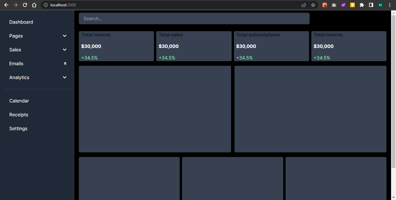
Since you already started the application earlier, open a browser and navigate to https://localhost:3000 (or whatever port your app is running on). The application homepage should be visible and look like the one shown in the image below:
Getting the data for the dashboard
Now that we have our dashboard layout set up, let’s go through the data we’ll use to create the charts.
Assuming this were a real-world dashboard, one way to get data is to request it from a database that stores our application data. You could also pull the data from an external data provider (for example, Google Analytics) or even get data from a realtime source like Ably.
Regardless of the source, the data that is used to plot charts in Recharts all have a similar structure - an array of objects with each object containing the data you want to plot on the chart. Here’s an example:
const data = [
    {
      "year": "2016",
      "Iphone": 4000,
      "Samsung": 2400
    },
    {
      "year": "2017",
      "Iphone": 3000,
      "Samsung": 1398
    }
 ]
To keep this tutorial simple we’ll only use dummy data to plot the charts. If you have a real data source you’d like to use, feel free to use that instead.
Creating the charts
In this section, we’ll focus on five different types of charts you can create with Recharts: area, line, bar, pie, and radar charts. You can always visit the documentation to see the other types of charts you can create with Recharts.
Creating an area chart
The first chart we’ll create on our admin dashboard is an area chart. In the src/components folder, create a file named AreaChartPlot.js which will contain the React component used to render the chart in the dashboard. Add the following code to import the necessary components from Recharts:
import { AreaChart, Area, XAxis, YAxis, Tooltip, ResponsiveContainer } from 'recharts';
The Recharts components added represent different elements of a chart and are as follows:
AreaChart: The main component representing the area chart.Area: The two Area components define the areas to be plotted on the chart. In the two Area components, we pass the value of the two items we want to represent on the graph,IphoneandSamsung.XAxis: Represents the x-axis of the chart. We pass thedataKeyprop as"year"to indicate that theyearproperty from the data object should be used as the x-axis value.YAxis: Represents the y-axis of the chart.Tooltip: A general (meaning you can use it with other types of charts) and customizable component that lets us display tooltips when hovering over data points on the chart.ResponsiveContainer: A general component that helps make the chart responsive to different screen sizes and fit into its parent container.
Next create an instance of the AreaChartPlot React component, and within it define an array of data. This will be the data we plot on the area chart.
const AreaChartPlot = () => {
  const data = [
    {
      "year": "2016",
      "Iphone": 4000,
      "Samsung": 2400
    },
    {
      "year": "2017",
      "Iphone": 3000,
      "Samsung": 1398
    },
    {
      "year": "2018",
      "Iphone": 2000,
      "Samsung": 9800
    },
    {
      "year": "2019",
      "Iphone": 2780,
      "Samsung": 3908
    },
    {
      "year": "2020",
      "Iphone": 1890,
      "Samsung": 4800
    },
    {
      "year": "2021",
      "Iphone": 2390,
      "Samsung": 3800
    },
    {
      "year": "2022",
      "Iphone": 3490,
      "Samsung": 4300
    }
  ]
}
export default AreaChartPlot;
Each object in the array represents a year and has properties for the year (year), iPhone sales (Iphone), and Samsung sales (Samsung). We’ll configure the AreaChart to use these different properties for its X and Y axis values.
Finally add the markup the component will render:
return (
  <>
    <ResponsiveContainer width="100%" height="100%" >
      <AreaChart width={730} height={250} data={data}
        margin={{ top: 10, right: 30, left: 0, bottom: 0 }}>
        <defs>
          <linearGradient id="colorUv" x1="0" y1="0" x2="0" y2="1">
            <stop offset="5%" stopColor="#8884d8" stopOpacity={0.8} />
            <stop offset="95%" stopColor="#8884d8" stopOpacity={0} />
          </linearGradient>
          <linearGradient id="colorPv" x1="0" y1="0" x2="0" y2="1">
            <stop offset="5%" stopColor="#82ca9d" stopOpacity={0.8} />
            <stop offset="95%" stopColor="#82ca9d" stopOpacity={0} />
          </linearGradient>
        </defs>
        <XAxis dataKey="year" />
        <YAxis />
        <Tooltip />
        <Area type="monotone" dataKey="Iphone" stroke="#8884d8" fillOpacity={1} fill="url(#colorUv)" />
        <Area type="monotone" dataKey="Samsung" stroke="#82ca9d" fillOpacity={1} fill="url(#colorPv)" />
      </AreaChart>
    </ResponsiveContainer>
  </>
);
This markup includes an <AreaChart/> component which itself contains a defs component. The defs component is an HTML SVG component used to define two linear-gradients and colors for the lines of the chart.
Also notice that we’ve bound the array of chart data we defined earlier to the AreaChart components data property. Doing this allows us to configure elements of the chart with different properties of the objects in the array. In this example we’ve told the chart to use the Iphone and Samsung properties as the values of two Area components (meaning the chart will contain 2 series of data) and the year property for the values of the single x-axis.
You can read more about the Recharts
With our AreaChartPlot component built we can render it on our dashboard by adding it to the existing Charts.js file:
'use client'
import AreaChartPlot from "./AreaChartPlot";

// ... rest of code

<section className="flex my-4 px-4 gap-3">
  <div className="w-1/2 h-[300px] bg-gray-700 rounded">
    <AreaChartPlot/>
  </div>
  <div className="w-1/2 h-[300px] bg-gray-700 rounded"></div>
</section>

// ... rest of code
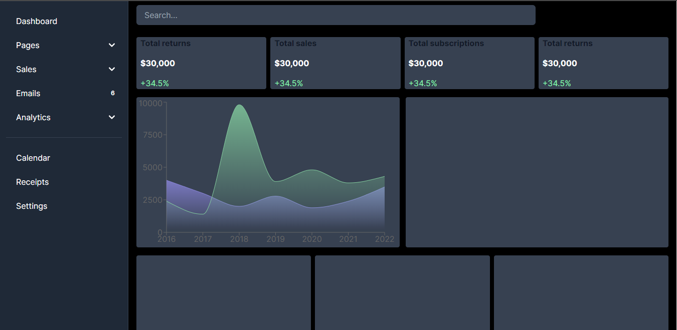
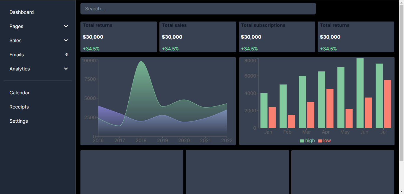
Make sure your application is still running (and if not start it again using the npm run dev command). The dashboard should re-render and now include the area chart (as shown below):
Creating a bar chart
Next, we’ll see how we can add a bar chart to the dashboard. The example below is a double bar chart - but you can also create other types of bar charts, such as a horizontal bar chart or stacked bar charts.
As with the previous AreaChart example, start by creating a new file to house the React component which will render the chart. In the src/components folder create a file named BarChartPlot.js and add the following code to it:
import { BarChart, XAxis, YAxis, Bar, Tooltip, Legend, ResponsiveContainer} from "recharts";
The Recharts components required for a Bar chart are:
BarChart: The main component representing the bar chart. We also pass thedataarray as a prop to theBarChartcomponent to specify the source of data for the chart.Bar: Defines the bars to be plotted on the chart. We specify thedataKeyprop as"value"to determine which property of the data objects should be used as the bar height, in this casehighandlow. We’re using twoBarcomponents here because we’re creating a double bar chart. Thefillprop sets the color of the bars.Legend: This adds a legend to the chart. It displays a color-coded key for the bars representing different data series which is displayed at the bottom of the chart.
Next, create an instance of the BarChartPlot React component, and within it define an array of data. This will be the data we plot on the bar chart.
const BarChartPlot = () => {
  const data = [
    {
        name: "Jan",
        high: 4000,
        low: 2400
    },
    {
        name: "Feb",
        high: 5000,
        low: 1500
    },
    {
        name: "Mar",
        high: 6000,
        low: 3000
    },
    {
        name: "Apr",
        high: 6500,
        low: 4500
    },
    {
        name: "May",
        high: 7000,
        low: 2200
    },
    {
        name: "Jun",
        high: 8000,
        low: 3500
    },
    {
        name: "Jul",
        high: 7400,
        low: 5500
    },
  ];
} export default BarChartPlot;
Add the markup the component will render:
return (
  <>
    <ResponsiveContainer width="100%" height="100%">
      <BarChart width={730} height={250} data={data}>
        <XAxis dataKey="name" />
        <YAxis />
        <Tooltip />
        <Legend />
        <Bar dataKey="high" fill="#82ca9d" />
        <Bar dataKey="low" fill="#FA8072" />
      </BarChart>
    </ResponsiveContainer>
  </>
);
This markup includes a <BarChart/> component, and like the AreaChart is bound to the data property containing our array of data. In this case we bind two <Bar> components to the high and low properties which as before will render two series and the XAxis component to the name property.
You can read more about the Recharts <BarChart> component and the many different ways you can configure it in the Rechart docs.
With our BarChartPlot component built we can render it on our dashboard by adding it to the existing Charts.js file:
'use client'
import AreaChartPlot from "./AreaChartPlot";
import BarChartPlot from "./BarChartPlot";

// ... rest of code

<section className="flex my-4 px-4 gap-3">
  <div className="w-1/2 h-[300px] bg-gray-700 rounded"><AreaChartPlot/></div>
  <div className="w-1/2 h-[300px] bg-gray-700 rounded"><BarChartPlot/></div>
</section>

// ... rest of code
And here is the chart rendered in the dashboard:
Creating a pie chart
Next we’ll add a pie chart to our admin dashboard. In the src/components folder, create a file named PieChartPlot.js and import the necessary components from recharts into it:
import { PieChart, Pie, Cell, Tooltip, ResponsiveContainer } from "recharts";
The components being imported are:
PieChart: The main component that wraps the child components to create the pie chart.Pie: This generates the pie circle. It has values suchcxandcywhich define the x and y coordinates of the pie chart.Cell: A map function loops through the data and generates a<Cell>component for each data object. Each<Cell>component represents a slice in the pie chart.
Next, add the following code to define the React component and data for the chart:
const PieChartPlot = () => {
  const data = [
    {
      name: "Twitter",
      value: 200400,
    },
    {
      name: "Facebook",
      value: 205000,
    },
    {
      name: "Instagram",
      value: 23400,
    },
    {
      name: "Snapchat",
      value: 20000,
    },
    {
      name: "LinkedIn",
      value: 29078,
    },
    {
      name: "YouTube",
      value: 18900,
    },
  ];
}
export default PieChartPlot;
For a Pie chart we also need to define a colors array. This array lets us indicate the colors available for each of the segments of the pie chart.
const PieChartPlot = () => {
  const colors = [
    "#8884d8",
    "#FA8072",
    "#AF69EE",
    "#3DED97",
    "#3AC7EB",
    "#F9A603",
  ];
  const data = [
    //...
  ];
}
export default PieChartPlot;
Next, let’s add the markup to render the component:
return (
  <>
    <ResponsiveContainer width="100%" height="100%">
      <PieChart width={730} height={250}>
        <Pie
          data={data}
          dataKey="value"
          nameKey="name"
          cx="50%"
          cy="50%"
          fill="#8884d8"
          label
        >
          {data.map((entry, index) => (
            <Cell key={`cell-${index}`} fill={colors[index]} />
          ))}
        </Pie>
        <Tooltip />
      </PieChart>
    </ResponsiveContainer>
  </>
);
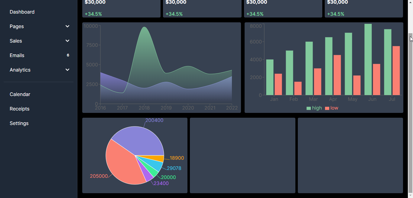
This markup includes a <PieChart/> component which itself contains a <Pie> component. The Pie component is bound to the data property containing our array of data and uses the dataKey property to indicate which array object property contains the numeric data, and the nameKey property to indicate which array object property contains the string label data.
Within the Pie we use a Map function to render a Cell component for each object in our array. The Cell components render the pie slices.
You can read more about the Recharts <PieChart> component and the many different ways you can configure it in the Rechart docs.
With our PieChartPlot component built we can render it on our dashboard by adding it to the existing Charts.js file:
'use client'
import AreaChartPlot from "./AreaChartPlot";
import BarChartPlot from "./BarChartPlot";
import PieChartPlot from "./PieChartPlot";

// ... rest of code

<section className="flex my-4 px-4 gap-2">
  <div className=" w-1/3 h-[250px] bg-gray-700 rounded"><PieChartPlot/></div>
  <div className=" w-1/3 h-[250px] bg-gray-700 rounded"></div>
  <div className=" w-1/3 h-[250px] bg-gray-700 rounded"></div>
</section>

// ... rest of code
The pie chart should now be rendered like below:
Creating a line chart
To create a line chart, create a file named LineChartPlot in src/components and add the following code to import the components for the Line chart from recharts:
import { LineChart, XAxis, YAxis, Line, Tooltip, Legend, CartesianGrid, ResponsiveContainer } from "recharts";
The components needed for a line chart are:
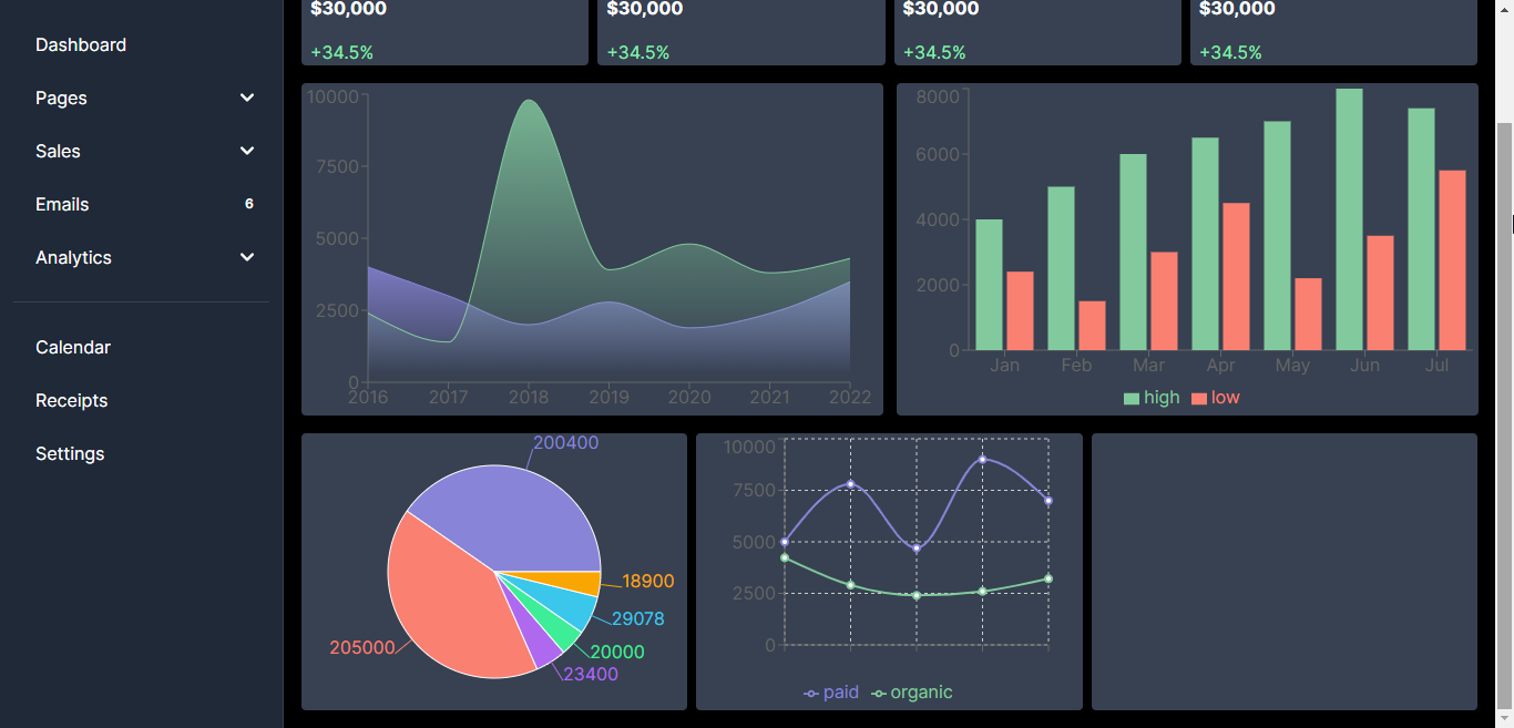
LineChart: The main wrapper component that wraps other children components to create the line chart.Line: The twoLinecomponents represent the “paid” and “organic” data values in our data source and also set the lines appearance.CartesianGrid: This is a general component that adds a Cartesian grid with stroke dash array to the chart
Next, let’s define the React component and line chart data:
const LineChartPlot = () => {
  const data = [
    {
      month: 'Jan',
      paid: 5000,
      organic: 4230
    },
    {
      month: 'Feb',
      paid: 7800,
      organic: 2900
    },
    {
      month: 'Mar',
      paid: 4700,
      organic: 2400
    },
    {
      month: 'Apr',
      paid: 9000,
      organic: 2600
    },
    {
      month: 'May',
      paid: 7000,
      organic: 3210
    }
  ];
};

export default LineChartPlot;
Add the markup the component renders:
return (
  <>
    <ResponsiveContainer width="100%" height="100%">
      <LineChart
        width={500}
        height={300}
        data={data}
        margin={{
          top: 5,
          right: 30,
          left: 20,
          bottom: 5,
        }}
        >
        <CartesianGrid strokeDasharray="3 3" />
        <XAxis dataKey="name" />
        <YAxis />
        <Tooltip />
        <Legend />
        <Line type="monotone" dataKey="paid" stroke="#8884d8" strokeWidth={2} />
        <Line type="monotone" dataKey="organic" stroke="#82ca9d" strokeWidth={2}/>
      </LineChart>
    </ResponsiveContainer>
  </>
);
Let’s understand what’s going on in the markup. The
You can read more about the Recharts
Now let’s import the LineChartPlot component into Charts.js as shown below:
'use client'
import AreaChartPlot from "./AreaChartPlot";
import BarChartPlot from "./BarChartPlot";
import PieChartPlot from "./PieChartPlot";
import LineChartPlot from "./LineChartPlot";

// ... rest of code

<section className="flex my-4 px-4 gap-2">
  <div className=" w-1/3 h-[250px] bg-gray-700 rounded"><PieChartPlot/></div>
  <div className=" w-1/3 h-[250px] bg-gray-700 rounded"><LineChartPlot/></div>
  <div className=" w-1/3 h-[250px] bg-gray-700 rounded"></div>
</section>

// ... rest of code
The line chart should now be rendered like below:
Creating a radar chart
Finally, let’s see how we can add a more unique chart: the radar chart.
If you are not familiar with a radar chart (also known by a variety of other names including web chart, spider chart, irregular polygon or polar chart), it's useful for showing multiple variables (three or more) compared on a two-dimensional plane. For example, if you wanted to visualize a the player statistics (shots, three pointers, rebounds, free throws, etc.) for a basketball team's starting lineup in a single chart, you might choose to use a radar chart for that.
Create a file named RadarChartPlot in src/components and add the following code to it:
import { RadarChart, Radar, PolarAngleAxis, PolarGrid, Legend, Tooltip, ResponsiveContainer } from "recharts";
As with all of our previous examples we need to import a number of components:
RadarChart: The main wrapper component to create the radar chart.Radar: This creates the actual radar plot and sets the data key to “amount” for the y-values. It also specifies the stroke color, fill color, and fill opacity. We also set the name value toOrderswhich is the description of the data we’re plotting.PolarAngleAxis: This defines the angle axis of the chart and also sets the data key to “day”.PolarGrid: This creates the hexagonal and web-like polar grid for the chart.
Next, let’s define our React component and the data used to create the chart:
const RadarChartPlot = () => {
  const data = [
    {
      "day": "Monday",
      "amount": 500
    },
    {
      "day": "Tuesday",
      "amount": 300
    },
    {
      "day": "Wednesday",
      "amount": 240
    },
    {
      "day": "Thursday",
      "amount": 230
    },
    {
      "day": "Friday",
      "amount": 150
    },
    {
      "day": "Saturday",
      "amount": 300
    }
  ];
};
export default RadarChartPlot;
The data source for the radar chart is the data array which contains objects representing the data points for the chart. Each object has properties for day and amount.
Add the component markup to render the radar chart:
return (
  <>
    <ResponsiveContainer width="100%" height="100%">
      <RadarChart outerRadius={90} width={730} height={250} data={data}>
        <PolarGrid />
        <PolarAngleAxis dataKey="day" />
        <Radar name="Orders" dataKey="amount" stroke="#82ca9d" fill="#82ca9d" fillOpacity={0.6} />
        <Legend />
        <Tooltip/>
      </RadarChart>
    </ResponsiveContainer>
  </>
);
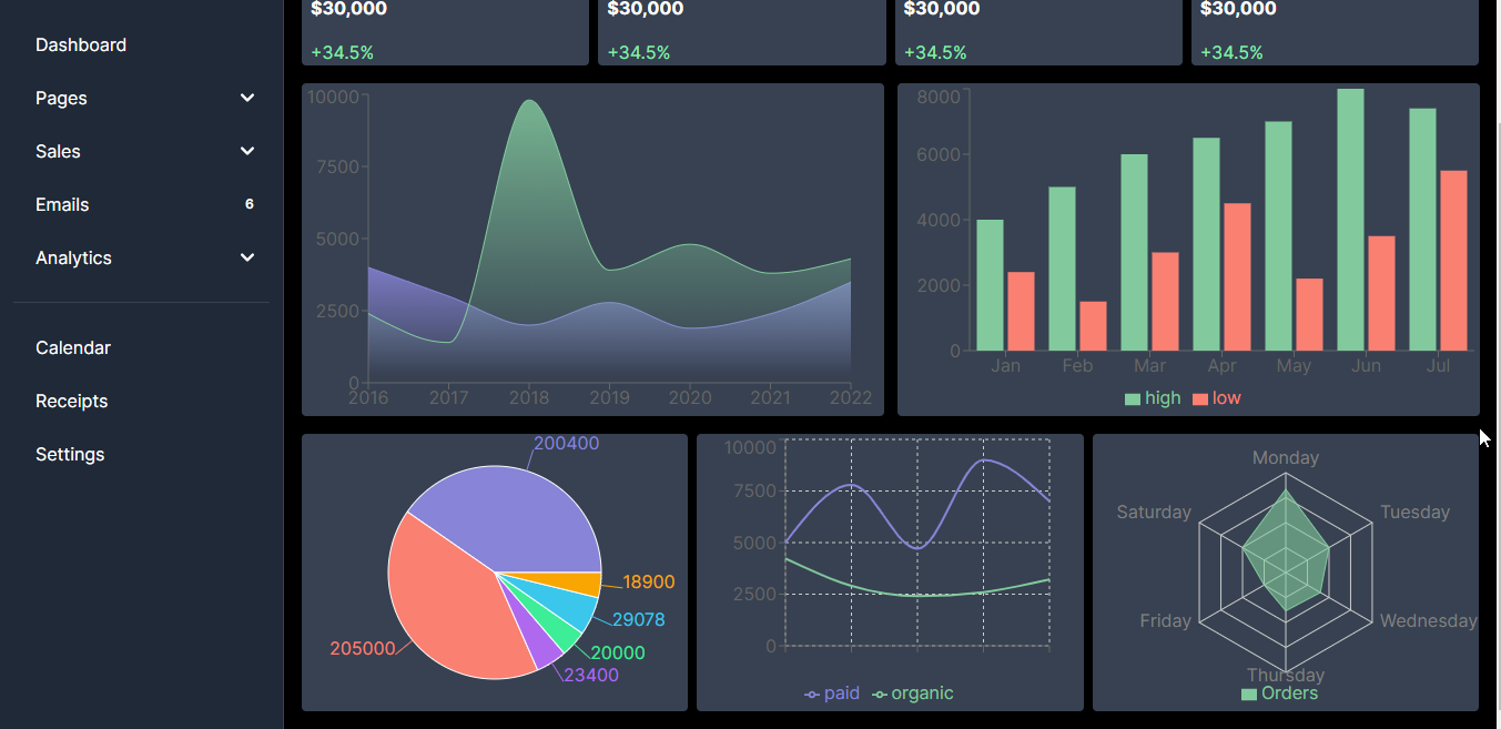
As you probably expected, the RadarChart component is bound to our data array. Within the component a PolarAngleAxis is defined and its dataKey set to the array objects day property. This is similar to the labels on an X axis.
Like the Area and Line charts the RadarChart uses a Radar component to define the chart series. In our example we have only one series of data, so the single Radar component has its dataKey property configured to the amount property of our array objects.
You can read more about the child components and customization options available for the RadarChart component in the Rechart docs.
Finally import the RadarChartPlot component into Charts.js as shown below:
'use client'
import AreaChartPlot from "./AreaChartPlot";
import BarChartPlot from "./BarChartPlot";
import PieChartPlot from "./PieChartPlot";
import LineChartPlot from "./LineChartPlot";
import RadarChartPlot from "./RadarChartPlot";

// ... rest of code

<section className="flex my-4 px-4 gap-2">
  <div className=" w-1/3 h-[250px] bg-gray-700 rounded"><PieChartPlot/></div>
  <div className=" w-1/3 h-[250px] bg-gray-700 rounded"><LineChartPlot/></div>
  <div className=" w-1/3 h-[250px] bg-gray-700 rounded">   <RadarChartPlot/></div>
</section>

 // ... rest of code
Now we can see the radar chart on the dashboard as shown below:
Congratulations! If you made it this far you should be confident enough to use Recharts to create beautiful charts for your dashboards and user interfaces.
Wrap-up
Information dashboards are critical for helping us make sense of complex and scattered data. They help organize and present data in ways that transform complex data relationships and data-driven insights into easy to understand information crucial to helping businesses make decisions.
In this tutorial we demonstrated how you can quickly build a dashboard containing charts and graphs using Next.js, Tailscale CSS and Recharts, a powerful but simple React charting library. Check out the Recharts documentation to learn more about the charts in this tutorial and others we didn’t explore.
So what's next?
As mentioned earlier in the article, typically dashboards get their data from a database. This article used static data sources for simplicity - but why not try connecting your data services to it? Next.js has features that can help you fetch data from a server side application, or better yet use a service like Ably to build a realtime dashboard!
Let us know what kind of dashboards your building and how you’re using data visualization to transform data into information by tweeting @ablyrealtime or dropping us a line in /r/ablyrealtime.
